Role and Timeline
As the UI/UX designer, I used Figma to redesign Perpay's admin across a five week period.
Context
The Admin tool is the backbone of the Operations team at Perpay; it allows the team to manage user accounts and carry out and oversee e-commerce processes. With the launch of new products like the Perpay Credit Card, it was imperative for the business to have an efficient Admin tool so that the new offerings could be launched smoothly.
I was tasked with refreshing the user interface and experience of the Admin tool to not only make it more user-friendly, but also ensure it serves the needs of the Operations team as the company ramps up the credit card & pursues other product offerings.
Challenge
To design a product-scalable and in-scope Admin that increases the Operations teams’ efficiency and ease of use.
Perpay’s existing admin was dated and unintuitive. Because the page length was so long, it was difficult for the Operations team to quickly scan through the pages to obtain information, and the amount of data loaded onto each page made it extremely slow and clunky.
Using Agile Methodology
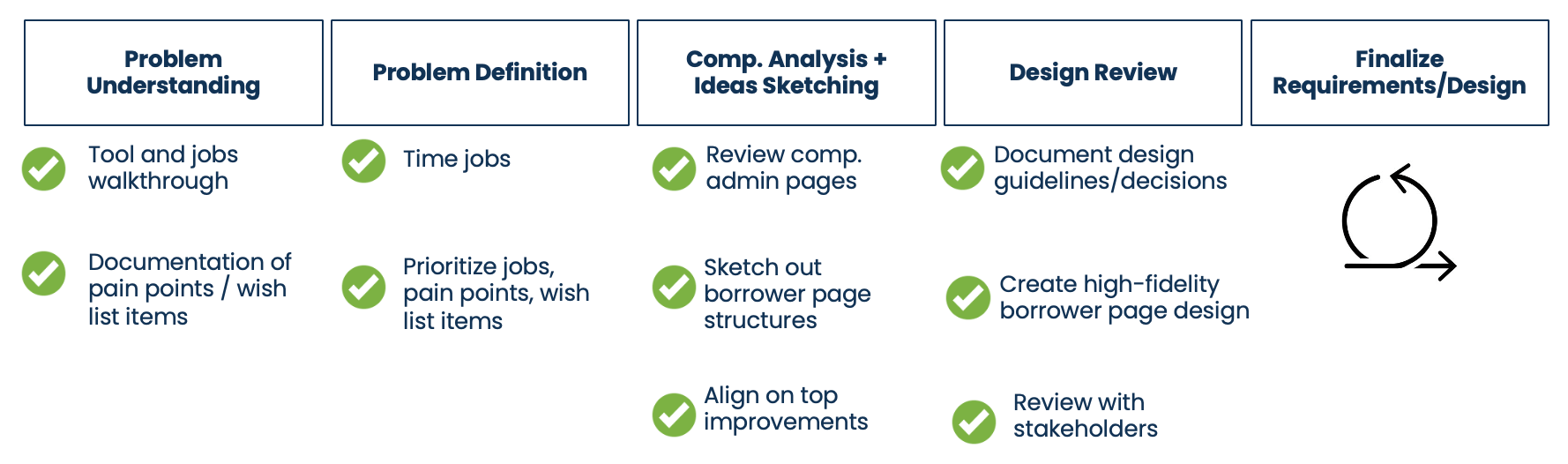
This project spanned across a five week period using the agile framework. The team consisted of two Operations members, two engineers, one product manager, and me as the UI/UX designer.
Understanding the User's Pain Points
The product manager and I conducted a series of user interviews, testing, and surveys with the Operations members to better understand their main pain points.
ↆ Existing Admin Design
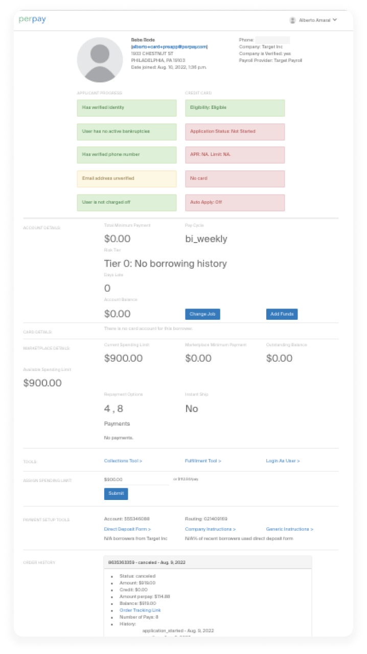
Here's what we found out:
- Excessive page length: Our users' number one pain point was the length of the page. Because their work relies on finding information at a glance, the unintuitive layout of the existing page adds on time to the users' tasks
- Slow page load: Because every customer support data point was loaded on the existing Admin page, the page took up to 2-3 minutes to load. With hundreds of customers to help each day, these minutes add up and make the users' work inefficient.
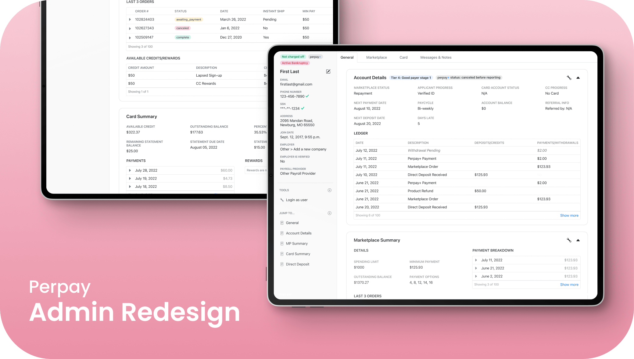
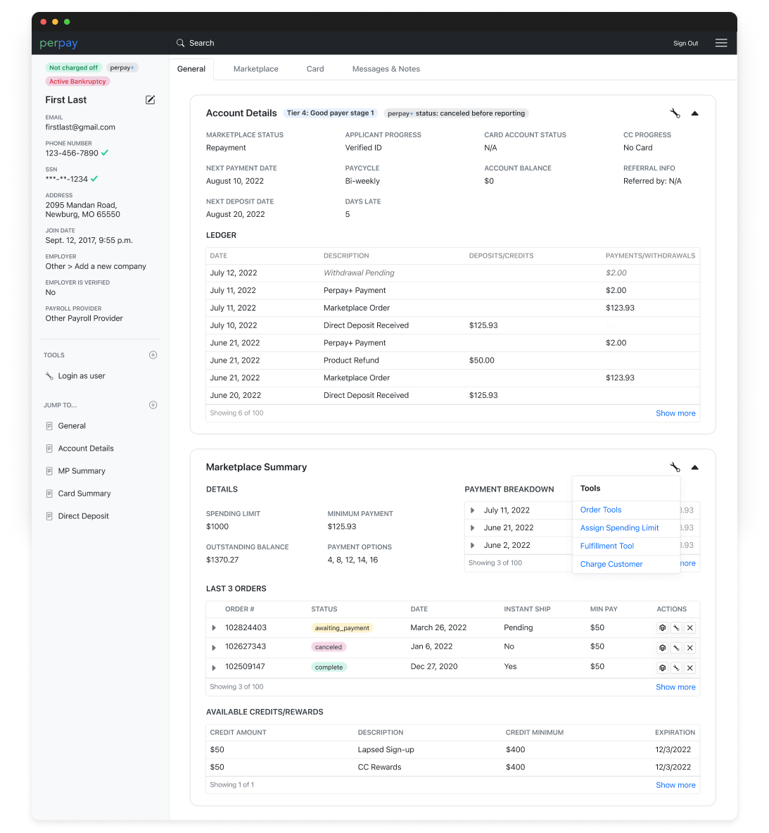
Final Prototype
Picture to show page length difference
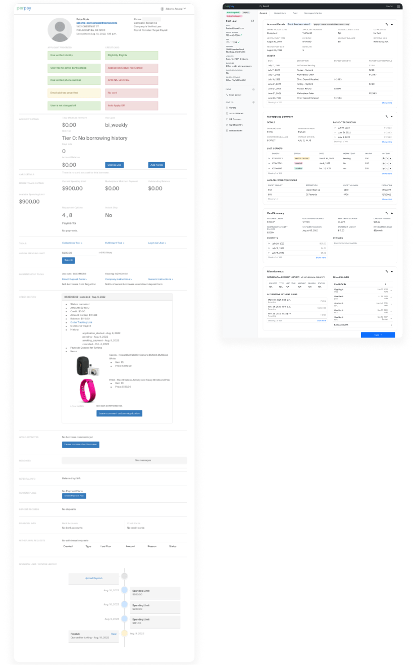
The Solution: Before & After
- Less scrolling: The redesign (right) maximizes the use of horizontal and vertical space with collapsible product summary cards and a side nav
- Customizable workflow: Ability to “favorite” tools and jump to links through the side nav saves Operations members' time
- Product-scalable: Components are standardized where possible, making product-scalability easy
- Faster loading: Fewer entries are loaded on page load - components include ability to “load more” entries if needed
Conclusion & Results
After the redesign was presented to the relevant stakeholders (engineers, product team, rest of the Operations team, and the CPO), we made a few changes but ultimately got the go ahead to build the redesign.
We timed the length of time the user needed to complete a task flow with the old and new design and we found out that the time taken to complete key tasks was decreased by 20%