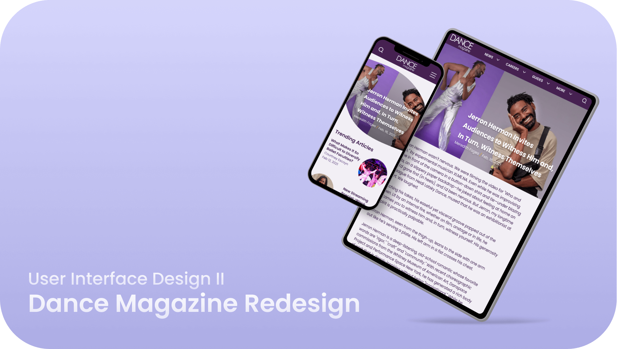
For my User Interface Design II project, I reorganized and redesigned Dance Magazine’s website to create a fluid, elegant, and modern interface that better represents the company and their mission.
Background
Dance Magazine is a news site that inspires, informs, and engages professional dancers, students, and dance lovers through their dance-related content.
My role as UI/UX designer was to redesign Dance Magazine’s mobile, tablet, and desktop interfaces to improve the user experience and visual design.
Defining the Problems
Main Challenges:
- Implement less distracting/overwhelming design
- Reorganize navigation
- Integrate sense of movement in design
Early Ideation
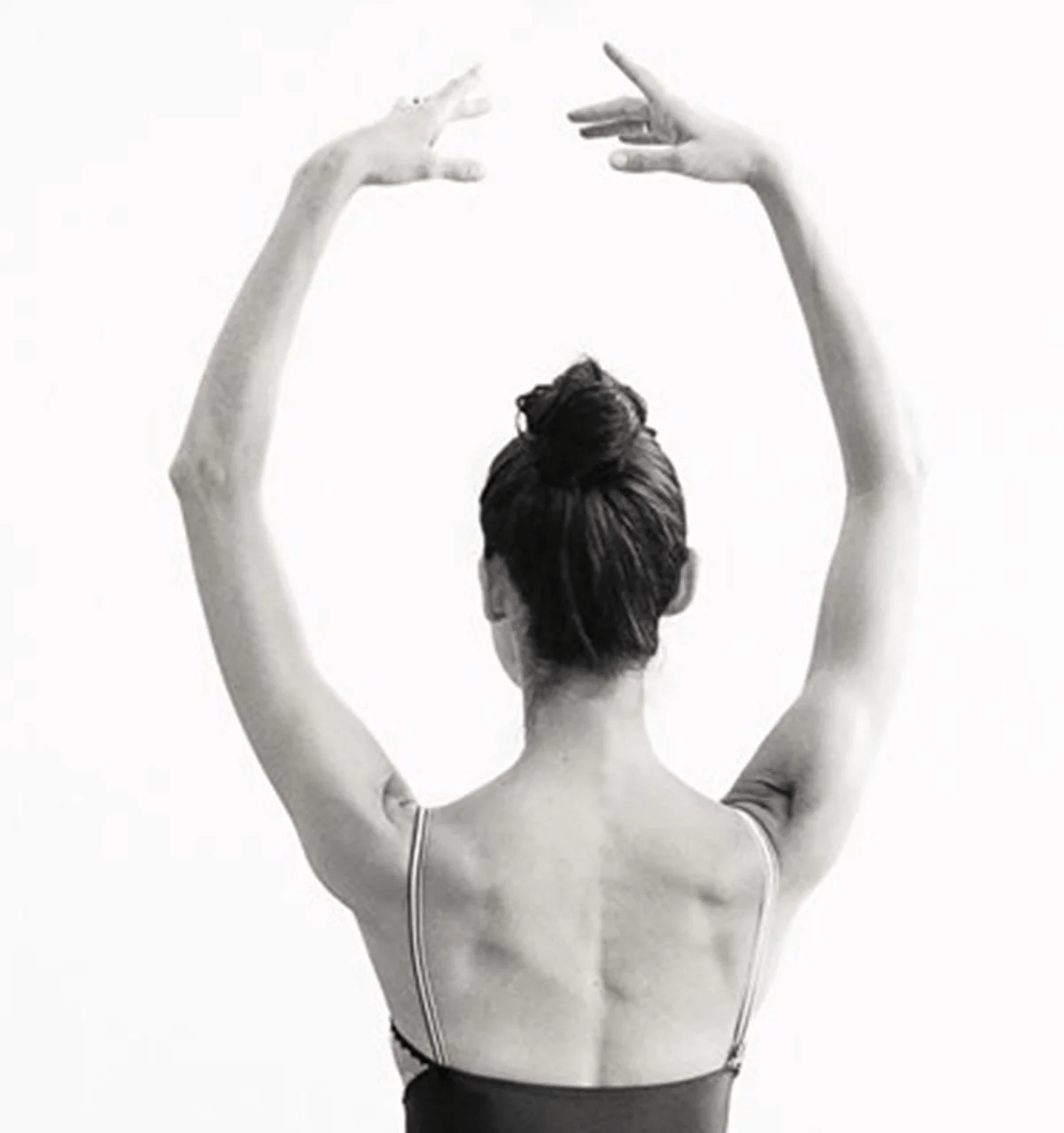
One of the main challenges from the original website was that the visual design lacked movement. To solve this, I researched dance positions and pulled inspiration from the reoccurring diagonals and rounded shapes.
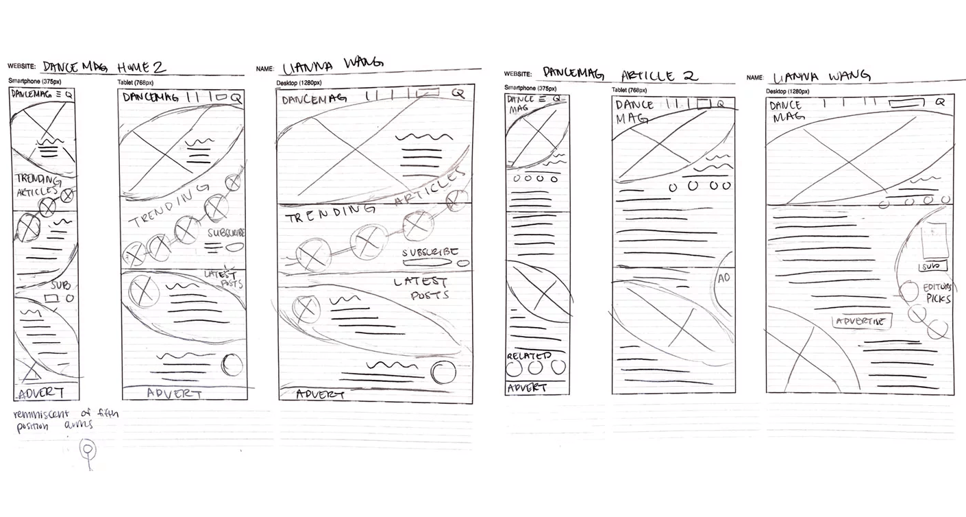
I chose the wireframe sketch above as the final wireframe because it represents movement through the integrated diagonals and circles. The rounded shapes were inspired by the shape a ballet dancer's arms make when they go into fifth position.
Mid-Fidelity Wireframes
Now that I knew how I wanted to lay out the site, I began to create my mid-fidelity prototype to add more detail.
Color and typography
After I finished mid-fi wireframes, I chose the colors and typography for the high fidelity prototype.
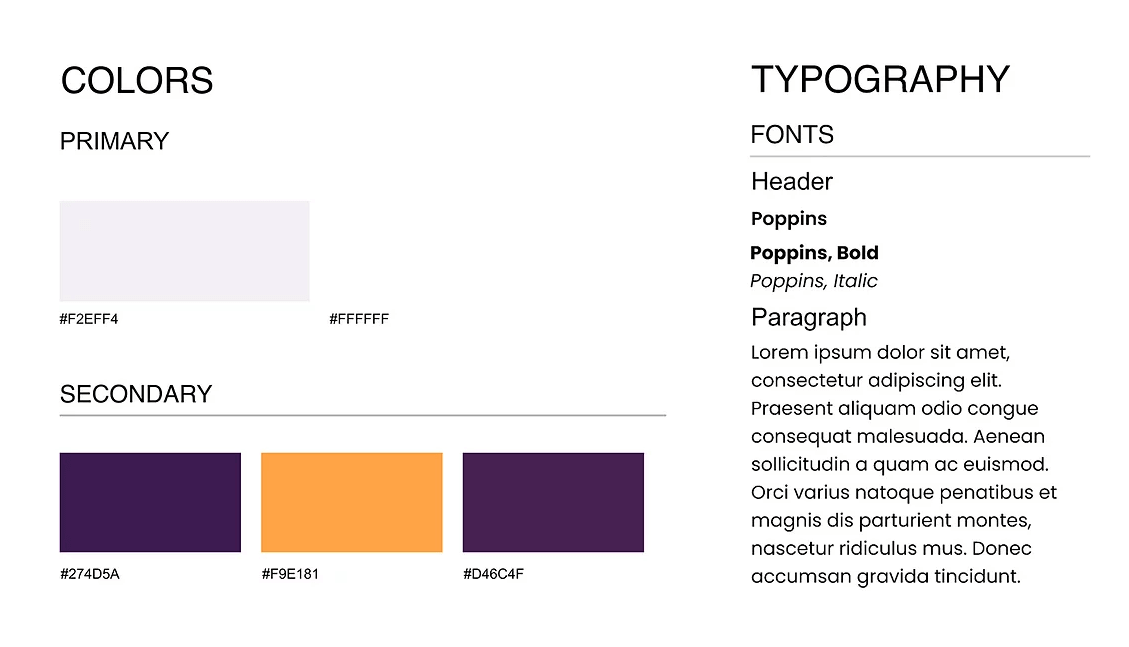
While dance can be fun and energizing, it is also elegant and graceful. Purple represents elegance and royalty, so I chose purple as my primary color. When I researched color theory, sources told me that the color orange was associated with health, activity, and motion, so I chose orange as a secondary color.
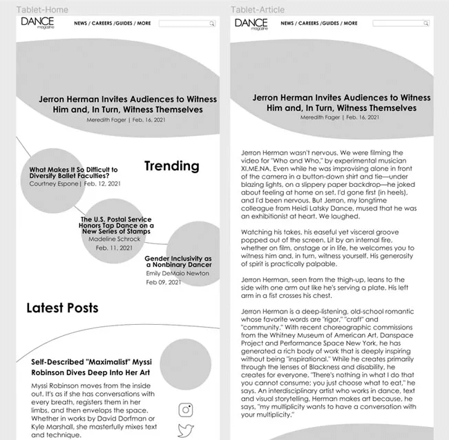
High Fidelity UI
After putting the colors in, I created my High Fidelity wireframes.
Final Prototype
Lastly, I added interactions through Figma. Enjoy the final product!
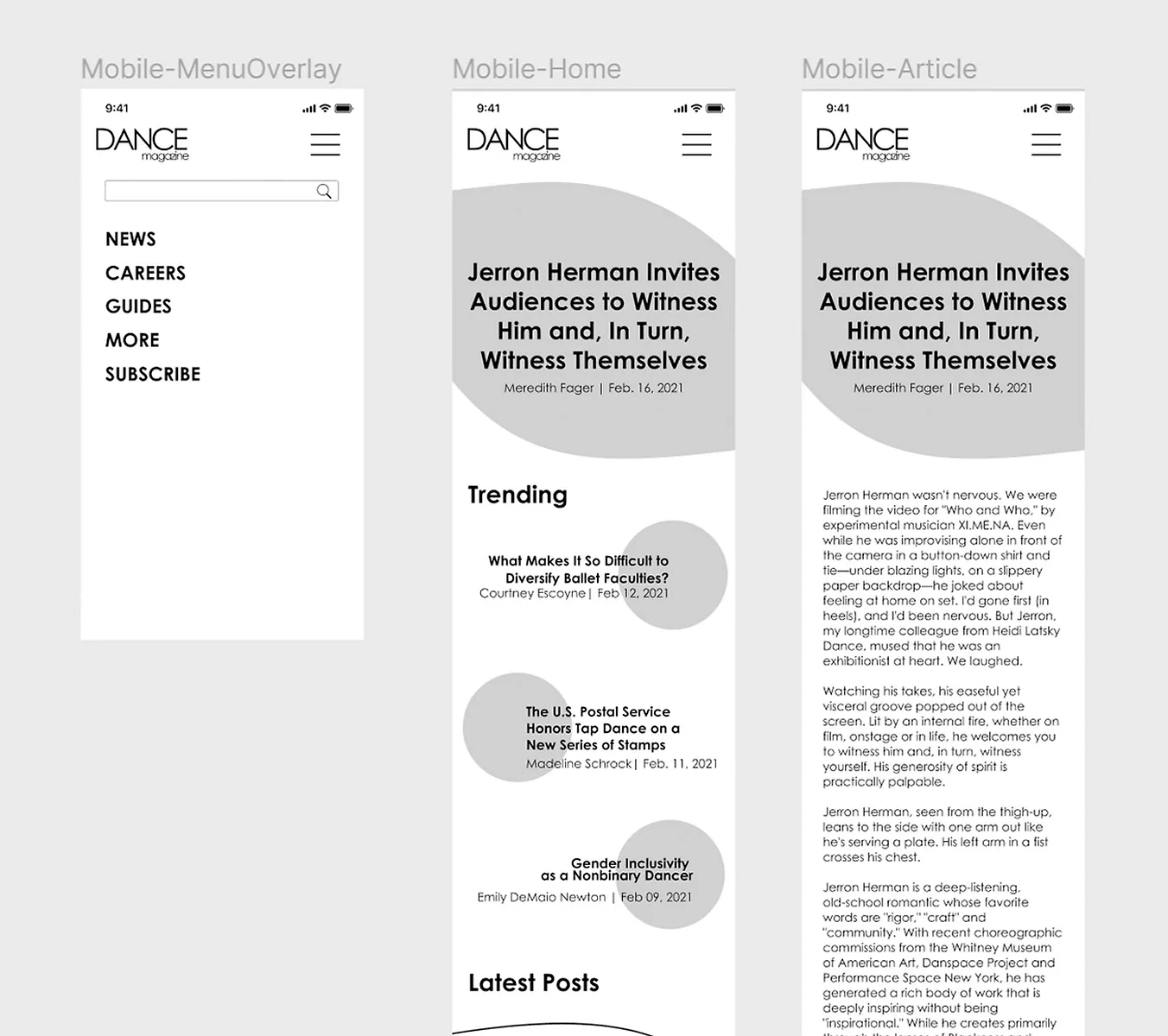
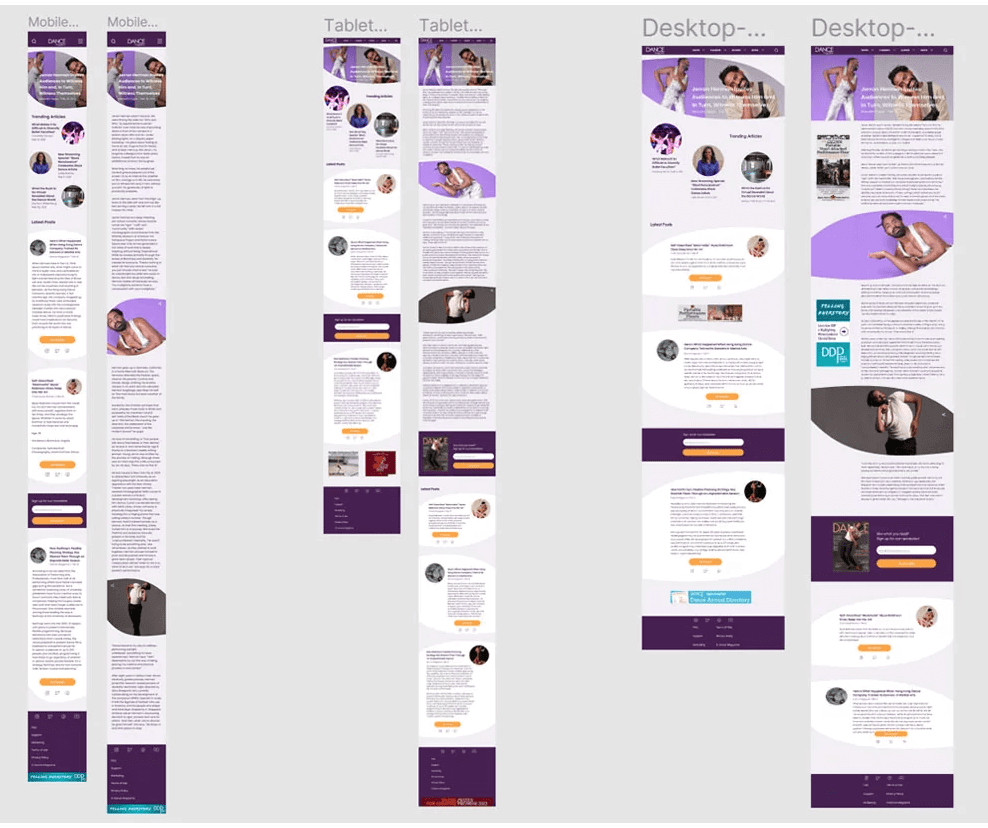
Mobile Breakpoint:
Tablet Breakpoint:
Desktop Breakpoint